There are vast amount of data visualization libraries in Python. Here take note of a few.
Pandas, matplotlib, and Jupyter
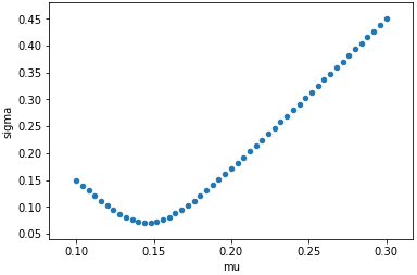
To make things simple, the data to plot is the distribution of mean and standard deviation of the sum of two normally distributed and correlated random variables in different weight. This is how we generate the data (50 data points):
import numpy as np
import pandas as pd

rho = -0.8 # correlation
mu1,sigma1 = 0.1,0.15
mu2,sigma2 = 0.3,0.45

def blend(mu1, sigma1, mu2, sigma2, rho):
    '''Assume RVs X1 ~ N(mu1,sigma1) and X2 ~ N(mu2,sigma2),
    return X = w1*X1+w2*X2 ~ N(mu,sigma) for w1+w2=1, w1 in [0,1]'''
    w1 = np.arange(0,1.001, 0.02)
    w2 = 1-w1
    mu = mu1*w1 + mu2*w2
    sigma = np.sqrt(sigma1*sigma1*w1*w1 + 2*rho*sigma1*sigma2*w1*w2 + sigma2*sigma2*w2*w2)
    return mu, sigma

mu,sigma = blend(mu1, sigma1, mu2, sigma2, rho)
df = pd.DataFrame(data=dict(mu=mu, sigma=sigma))
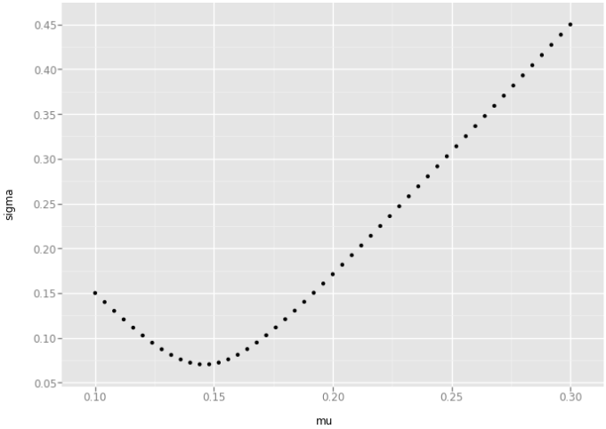
The \((x,y)\) coordinates are in vectors mu and sigma, as well as combined
into a dataframe df. Python pandas can plot the data directly, using matplotlib:
df.plot(x='mu', y='sigma', kind='scatter')
If plotting this in Jupyter, we need to issue this magic in the first line of the Python code:
%matplotlib inline
which inline is for static charts. We can use notebook or ipympl instead
(if appropriate Jupyter plugins are installed) to get interactive charts.
On the other hand, we can also invoke matplotlib directly to plot:
import matplotlib.pyplot as plt
plt.scatter(mu,sigma) # plot for line plot
plt.ylabel('sigma')
plt.xlabel('mu')
plt.show()
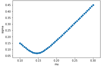
The bad thing about matplotlib is its verbosity. It takes too much polishing
to make the graph appealing. The plotting function in pandas is a rather thin
wrapper to it.
Seaborn
Seaborn is also a wrapper to matplotlib but it make the default visualization
more appealing. For example:
import seaborn as sns
sns.regplot(mu, sigma, fit_reg=False) # fit_reg: do not do linear regression
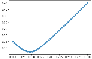
In the above example, seaborn by default will give the linear regression line together with scatter plot. This is what seaborn does in setting up the default: make common things easier to use.
ggplot
ggplot is also on top of matplotlib to improve the
visual appeal. It is a port of ggplot2 form R, therefore its API is not pythonic.
In my use, I found that ggplot uses deprecated functions from pandas. I
need to replace pandas.tslib.Timestamp into pandas.Timestamp in a few
places after I installed the python module.
import ggplot as gg
p = gg.ggplot(df, gg.aes(x="mu", y="sigma")) \
    + gg.geom_point() \
	+ gg.xlab("mu") \
	+ gg.ylab("sigma")
print(p)
bokeh
Bokeh is an open-source package for browsers. The graph is produced in HTML and it will be interactive by default.
import bokeh.plotting as bk
from bokeh.io import output_notebook
output_notebook() # need this for jupyter inline display
                  # jupyterlab: need `jupyter labextension install jupyterlab_bokeh`
p = bk.figure(plot_width=400, plot_height=400)
p.circle(mu,sigma,size=2)
bk.show(p)
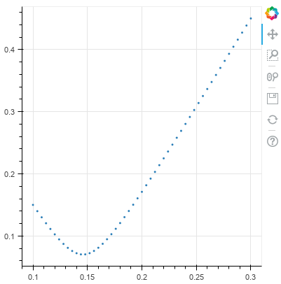
Using bokeh in Jupyter notebook needs to have the Jupyter extension installed
and execute the output_notebook() call before plotting. The extension is installed with
jupyter labextension install jupyterlab_bokeh
pygal
pygal is also a library for HTML-based chartting. It produces charts in SVG format. To produce a chart in Jupyter notebook, we use the following:
import pygal
from IPython.display import HTML
chart = pygal.XY()
chart.add(title="", values=list(zip(mu, sigma)))
htmltemplate = '''
<!DOCTYPE html>
<html>
  <head>
  <script type="text/javascript" src="http://kozea.github.com/pygal.js/javascripts/svg.jquery.js"></script>
  <script type="text/javascript" src="http://kozea.github.com/pygal.js/javascripts/pygal-tooltips.js"></script>
  </head>
  <body>
    <figure>
      {pygal_render}
    </figure>
  </body>
</html>
'''
HTML(htmltemplate.format(pygal_render=chart.render()))
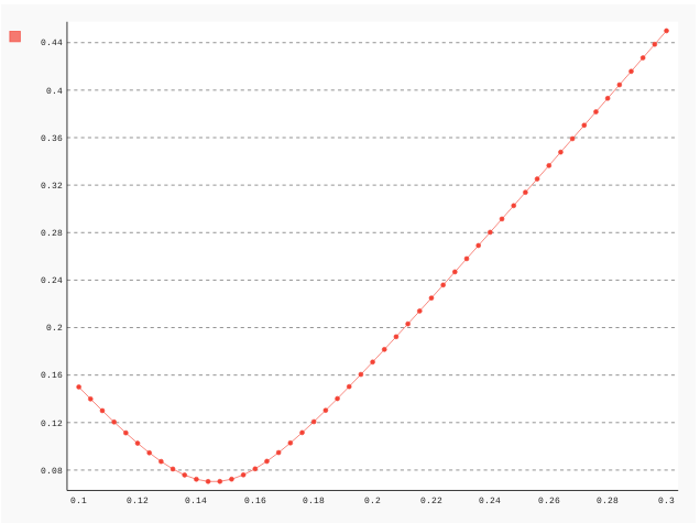
In order to display the SVG chart in Jupyter, we need to make use of HTML()
from IPython.display and embed the SVG code into a HTML template, as above.
Plot.ly
This is the proprietry library. It has its own documentation and it needs to have its extension installed for Jupyter to work:
jupyter labextension install @jupyterlab/plotly-extension
The code to use plot.ly is:
import plotly.offline as po
import plotly.graph_objs as go

data = go.Data([
    go.Scatter(
        x=mu,
        y=sigma,
        showlegend=False,
        mode='markers'
    )
])
layout = go.Layout(
    xaxis = go.XAxis(title = "mu", tickangle=45),
    yaxis = go.YAxis(title = "sigma")
)
po.iplot(dict(data=data, layout=layout))
!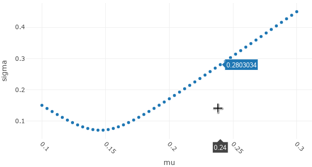
And the chart is by default interactive.
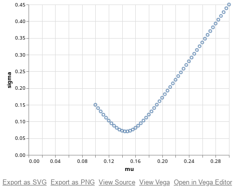
Altair
Altair is new and exciting. It supports Vega! (may be indeed the more concise form, Vega-lite)
import altair as alt
alt.Chart(df).mark_point().encode(x='mu',y='sigma')