I posted about a paper on a family of definitions of percentile functions, but what about weighted percentiles?
The use case is that, if we have a set of measurements \(X_1,\cdots,X_N\) with a lot of duplicates such that there are \(w_1\) count of \(x_1\), and so on until \(w_k\) count of \(x_k\). How can we express the percentile function in terms of \((w_i, x_i)\) pairs? Moreover, if we are given a sampling on these measurements, can we also have a percentile function defined?
Just like the percentile function, we can have a family of definitions of weighted percentile function. But if we are given a set of \((w_i, x_i)\) pairs, we might want to have the percentile and inverse percentile function defined such that
- percentile function \(x=Q(p)\) is defined over the domain of \([0,1]\) and inverse percentile function \(p=Q^{-1}(x)\) has its range over \([0,1]\)
- minima defined from data: \(Q(0) = \min(X_1,\cdots,X_N)\)
- maxima defined from data: \(Q(1) = \max(X_1,\cdots,X_N)\)
We will discuss about the last two points later. But the first is what the percentile function should be. If we consider \((w_i, x_i)\) pairs, and try to plot them, it should be like this:
import pandas as pd
import numpy as np
import matplotlib.pyplot as plt
import seaborn as sns

sns.set()

# generate data
aw = pd.DataFrame(np.random.random((10,2)), columns=['a','w']).sort_values(by='a')
aw['cw'] = np.cumsum(aw['w']/aw['w'].sum())
cumw = np.insert(aw['cw'].values, 0, 0)

# staircase chart
list_data = [pd.Series([a, a], index=[w0, w1]) for a, w0, w1 in zip(aw['a'].values, cumw, cumw[1:])]
fig, ax = plt.subplots(figsize=(6,4))
for series in list_data:
    sns.lineplot(data=series, color='blue', ax=ax)
sns.scatterplot(data=aw, x='cw', y='a', color='red')
sns.scatterplot(x=cumw[:-1], y=aw['a'], color='green')
sns.scatterplot(x=[(a+b)/2 for a, b in zip(cumw, cumw[1:])], y=aw['a'], color='violet')
plt.show()
for the following data:
| a | w | cw |
|---|---|---|
| 0.055514 | 0.356360 | 0.058595 |
| 0.260828 | 0.834965 | 0.195886 |
| 0.322957 | 0.164542 | 0.222942 |
| 0.375759 | 0.861362 | 0.364573 |
| 0.424265 | 0.804669 | 0.496883 |
| 0.445871 | 0.556410 | 0.588372 |
| 0.568817 | 0.918438 | 0.739388 |
| 0.620925 | 0.514526 | 0.823990 |
| 0.644806 | 0.484988 | 0.903736 |
| 0.935036 | 0.585451 | 1.000000 |
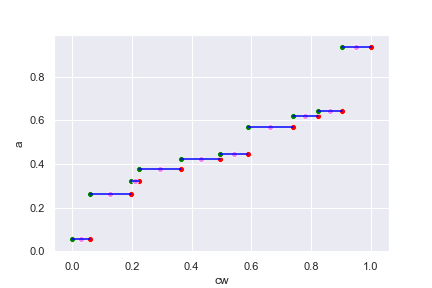
The above chart should be viewed as a weighted version of histogram. Each line
segment corresponds to the data value a in the table above, which is
pre-sorted in ascending order. The width of the line segment corresponds to the
weight w. We normalized the weight so that they sum to 1 on the chart (for
percentile defined over \([0,1]\)) and the cumulative of the normalized weight
is the cw column above.
I deliberately put the green, red, and violet dots on the line segments in the above chart to mark the min, max, and mid point. For any given \(p\in[0,1]\), what can we infer \(x=Q(p)\) from the above chart? An intuitive way is to simply treat the chart as \(x\) against \(p\) chart for function \(Q(p)\) and read the answer directly from it. Then \(Q(p)\) will have the range of exact the set \(\{x_1,\cdots,x_k\}\) of discrete values. The inverse percentile function \(Q^{-1}(x)\) however, is not defined for continuous range. If \(x_i\) is given, what should be \(Q^{-1}(x_i)\)? From the chart, it seems any where of the line segment may work. We can take the green dot, which is the minimum valid value for \(x_i\), or the red dot for the maximum, or the violet dot for the mean.
So here it is: We may want to define \(Q^{-1}(x)\) on \([x_{\min}, x_{\max}]\) so that it is defined over a continuous range. This is useful if the values and weights \((w_i, x_i)\) are just approximate we used to model a bigger system. In doing so, instead of drawing the staircase chart above, we join the (say) right dots:
fig, ax = plt.subplots(figsize=(6,4))
for series in list_data:
    sns.lineplot(data=series, color='blue', ax=ax)
sns.lineplot(y=np.insert(aw["a"].values, 0, aw["a"][0]),
             x=np.insert(aw["cw"].values, 0, 0),
             estimator=None, sort=False, color="red", ax=ax)
plt.show()
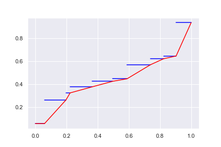
This way, we have a continuous spectrum of range for \(Q(p)\) and we reinterpret the weight \(w_i\) roughly as the slope for value \(x_i\). However, we still have a flat region at \(x_{\min}\). Surely we can try to connect not on the right end of the “staircase” but on the left end:
fig, ax = plt.subplots(figsize=(6,4))
for series in list_data:
    sns.lineplot(data=series, color='blue', ax=ax)
sns.lineplot(y=np.insert(aw["a"].values, len(aw), aw['a'].values[-1]),
             x=np.insert(aw["cw"].values, 0, 0),
             estimator=None, sort=False, color="green", ax=ax)
plt.show()
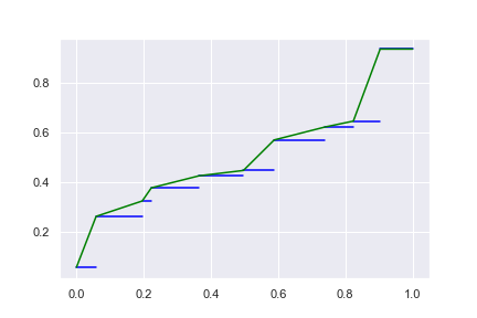
and this continuous spectrum will have a flat region at \(x_{\max}\). If connect on the mid-point, we can have the flat region at both:
fig, ax = plt.subplots(figsize=(6,4))
for series in list_data:
    sns.lineplot(data=series, color='blue', ax=ax)
sns.lineplot(
    y = np.insert(np.insert(aw["a"].values, len(aw), aw['a'].values[-1]), 0, aw['a'].values[0]),
    x = np.array([0] + [(w1+w2)/2 for w1, w2 in zip(np.insert(aw["cw"].values, 0, 0), aw["cw"].values)] + [1]),
    estimator=None, sort=False, color="violet", ax=ax)
plt.show()
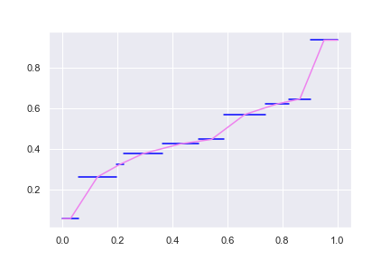
The flat region is surely due the condition of \(Q(0) = \min(X_1,\cdots,X_N)\) and \(Q(1) = \max(X_1,\cdots,X_N)\) we imposed. Otherwise we might consider extending the slope of the ends of the spectrum to complete the curve.
Below is the weighted percentile function modified from the percentile function in numpy, implementing the above algorithm: