A nice book for leisure reading, and helps making better decisions on choice of fonts and page layout. It has a website too: http://thinkingwithtype.com
Notes below:
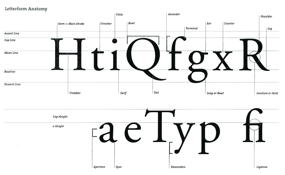
Letter
- Uppercase and lowercase are referring to the physical letterpress cases that holds capital letters and minuscule letters
- Typeface is the design, font is the delivery mechanism
- Gutenberg’s typeface: Blackletter. Then printers of later generations invented their own typefaces, e.g. Jenson, Garamond, Bembo, Palatino, Caslon, Baskerville, Didot
- The typefaces are named after their printers
- First the humanist typefaces, then thhe transitional and modern
- Font size are identified by its height, meausred from the cap line to descender line. However, perceived size is the x-height. Align the x-height when mixing fonts
- Font sizes are measured in points, or pica (12 points = 1 pica)
- Font and linespacing: 8/9 Helvetica = 8 pts font and 9 pts line spacing
- Numerals that take up uniform widths of space = Lining numerals; they are invented at 1900s for modern business
- Quotation marks make spaces at edge of text. This can be solved by hanging punctuations which move them to the margin
Text
- Kerning = Space between letters; type designers provies kerning table to tell how much space between different letter combinations
- metric kerning: Use kerning tables provided by the type designer
- optical kerning: computationally adjusted kerning
- Tracking = letterspacing; usually applied on headlines to increase spacing for emphasis
- Negative tracking usually not comfortable; positive tracking on lowercase may look awkward
- Leading = line spacing = distance between baseline of one line to another
- default usually 120% of the type size
- Flush right also called ragged left
- Paragraph indent is common since 17th century. Size is usually an em space a.k.a. quad, which is approximately a cap height
- Space after paragraph: Skipping half line should be good enough without too much open space
- Paragraphs separated with ∥ in ancient text
Grid
- For control
- Golden section page design: Text rectangle in golden section, positioned on a page (e.g., letter paper) with uneven margins (e.g., bottom and right are wider than top and left)
- Multicolumn grid design:

- Modular grid:

Bibliographic data
@book{
   title = "Thinking with type: A critical guide for designers, writers, editors, & students",
   edition = "2nd",
   author = "Ellen Lupton",
   year = "2010",
   publisher = "Princeton Architectural Press",
   address = "New York, NY",
   isbn = "978-1-56898-969-3",
}