Both QQ-plot and PP-plot are called the probability plot, but they are different. These plots are intended to compare two distributions, usually at least one of them is empirical. It is to graphically tell how good the two distributions fit.
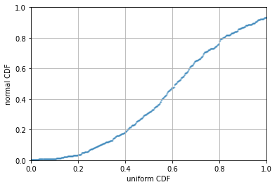
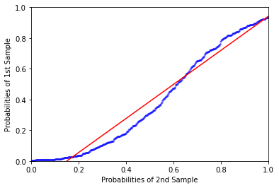
Assume the two distributions have the cumulative distribution functions \(F(x)\) and \(G(x)\), the PP-plot is to show \(G(x)\) against \(F(x)\) for varying \(x\). Hence the domain and range of the plot is always from 0 to 1, as we are plotting only the range of the cumulative distribution functions.
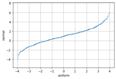
QQ-plot, however, is to plot the inverse cumulative distribution function \(G^{-1}(x)\) against \(F^{-1}(x)\) for varying \(x\in[0,1]\). Therefore the domain and range of the plot are the support of the cumulative distribution functions \(F(x)\) and \(G(x)\). If we consider the data are empirical, we can see this as the plot of the order statistic of \(G(x)\) against that of \(F(x)\).
Tools
In Python, it is a surprise that matplotlib does not support making PP-plot nor QQ-plot out of the box. However, it should not be difficult to see that we can make use of the order statistics to do the QQ-plot:
import numpy as np
import matplotlib.pyplot as plt

N = 1000 # number of samples
rv_norm = np.random.randn(N) * 2 + 1  # normal with mean 1 s.d. 2
rv_uni = np.random.rand(N) * 8 - 4    # uniform in [-4,4]

plt.scatter(np.sort(rv_uni). np.sort(rv_norm), alpha=0.2, s=2)
PP-plot is a bit more complicated. We need to use interpolation function to
achieve that. The idea is that, the CDF of an empirical distribution can be
constructed using np.sort(rv_norm) and np.linspace(0,1,N). Then with the
other distribution, we can look up the value of the CDF by interpolation using
np.interp(x0, x, y), which is to return \(y_0 = f(x_0)\) from the provided
curve \(y=f(x)\):
plt.scatter(np.linspace(0,1,N), np.interp(np.sort(rv_uni), np.sort(rv_norm), np.linspace(0,1,N)), alpha=0.2, s=2)
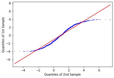
However, there is a fancier tool in Python to do this. statsmodels has
functions qqplot() and qqplot_2samples() for doing QQ-plot of one empirical
against theoretical normal distribution, and between two empirical
distributions, respectively. But it is just a wrapper for the more generic
ProbPlot object. For example, this is how we can do the same as above:
import statsmodels.api as sm

_ = sm.ProbPlot(rv_uni) \
      .qqplot(other=sm.ProbPlot(rv_norm), line="r", alpha=0.2, ms=2, lw=1)

plt.show()
_ = sm.ProbPlot(rv_uni) \
      .ppplot(other=sm.ProbPlot(rv_norm), line="r", alpha=0.2, ms=2, lw=1)
plt.show()
its output will go with the regression line (line="r"):
QQ-plot and PP-plot as EDA tool
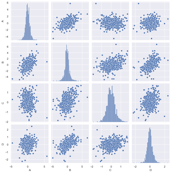
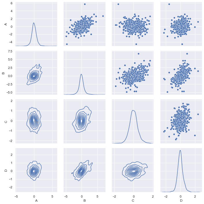
When we get a table of data the first time, we would like to get some insight from it before further processing it. This is what the exploratory data analysis is about. For a multidimensional data set, my favorite is to run a correlogram to see how the data looks like, visually:
import seaborn as sns
sns.pairplot(df_data)
This graph is generated using Seaborn, a wrapper for matplotlib. We can make the graph prettier, for example, draw the regression line between each pair of data and show the CDF empirically found by KDE instead of histogram:
sns.pairplot(df_data, diag_kind="kde", kind="reg",
             plot_kws={'line_kws':{'color':'red', 'alpha':0.2}, 'scatter_kws': {'alpha': 0.2, 's':4}},
            )
plt.show()
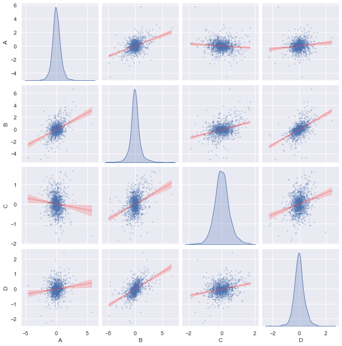
We call the same Seaborn function pairplot() with the kind="reg"
(regression) for off-diagonal charts and diag_kind="kde" for on-diagonal
charts. This tells you how correlated are any two series and the distribution
of each sample. In this graph, we do not see any particularly strong
correlation. So how about the series are independent but in the similar
distribution? This can be answered by a PP-plot of each pair. Unfortunately,
PP-plot and QQ-plot are not supported by Seaborn. Nevertheless we an add this.
Here is the patch file, we need only to modify axisgrid.py and regression.py:
diff --git a/seaborn/axisgrid.py b/seaborn/axisgrid.py
index ba70553..7a9d836 100644
--- a/seaborn/axisgrid.py
+++ b/seaborn/axisgrid.py
@@ -1959,6 +1959,7 @@ def pairplot(
     """
     # Avoid circular import
     from .distributions import histplot, kdeplot
+    from .regression import qqplot, ppplot  # Avoid circular import

     # Handle deprecations
     if size is not None:
@@ -1992,7 +1993,7 @@ def pairplot(
     # Add the markers here as PairGrid has figured out how many levels of the
     # hue variable are needed and we don't want to duplicate that process
     if markers is not None:
-        if kind == "reg":
+        if kind in ["reg", "pp", "qq"]:
             # Needed until regplot supports style
             if grid.hue_names is None:
                 n_markers = 1
@@ -2020,6 +2021,10 @@ def pairplot(
         diag_kws.setdefault("fill", True)
         diag_kws.setdefault("warn_singular", False)
         grid.map_diag(kdeplot, **diag_kws)
+    elif diag_kind == "pp":
+        grid.map_diag(ppplot, **diag_kws)
+    elif diag_kind == "qq":
+        grid.map_diag(qqplot, **diag_kws)

     # Maybe plot on the off-diagonals
     if diag_kind is not None:
@@ -2030,6 +2035,10 @@ def pairplot(
     if kind == "scatter":
         from .relational import scatterplot  # Avoid circular import
         plotter(scatterplot, **plot_kws)
+    elif kind == "qq":
+        plotter(qqplot, **plot_kws)
+    elif kind == "pp":
+        plotter(ppplot, **plot_kws)
     elif kind == "reg":
         from .regression import regplot  # Avoid circular import
         plotter(regplot, **plot_kws)
diff --git a/seaborn/regression.py b/seaborn/regression.py
index ce21927..cc366d1 100644
--- a/seaborn/regression.py
+++ b/seaborn/regression.py
@@ -20,7 +20,7 @@ from .axisgrid import FacetGrid, _facet_docs
 from ._decorators import _deprecate_positional_args


-__all__ = ["lmplot", "regplot", "residplot"]
+__all__ = ["lmplot", "regplot", "residplot", "ppplot", "qqplot"]


 class _LinearPlotter(object):
@@ -833,6 +833,91 @@ lmplot.__doc__ = dedent("""\
     """).format(**_regression_docs)


+@_deprecate_positional_args
+def qqplot(
+    *,
+    x=None, y=None,
+    data=None,
+    x_estimator=None, x_bins=None, x_ci="ci",
+    scatter=True, fit_reg=True, ci=95, n_boot=1000, units=None,
+    seed=None, order=1, logistic=False, lowess=False, robust=False,
+    logx=False, x_partial=None, y_partial=None,
+    truncate=True, dropna=True, x_jitter=None, y_jitter=None,
+    label=None, color=None, marker="o",
+    scatter_kws=None, line_kws=None, ax=None,
+    legend=None
+):
+
+    plotter = _RegressionPlotter(x, y, data, x_estimator, x_bins, x_ci,
+                                 scatter, fit_reg, ci, n_boot, units, seed,
+                                 order, logistic, lowess, robust, logx,
+                                 x_partial, y_partial, truncate, dropna,
+                                 x_jitter, y_jitter, color, label)
+
+    # Manipulate input data for plotting
+    if plotter.x is None:
+        err = "missing x or y in plot data"
+        raise ValueError(err)
+    if plotter.y is None:
+        # set it to normal distribution scaled according to x
+        from scipy.stats import norm
+        plotter.y = norm.ppf(np.linspace(0,1,len(plotter.x)+2)[1:-1])
+        plotter.y = plotter.y * plotter.x.std() + plotter.x.mean()
+    plotter.x = np.sort(plotter.x)
+    plotter.y = np.sort(plotter.y)
+
+    if ax is None:
+        ax = plt.gca()
+
+    scatter_kws = {} if scatter_kws is None else copy.copy(scatter_kws)
+    scatter_kws["marker"] = marker
+    line_kws = {} if line_kws is None else copy.copy(line_kws)
+    plotter.plot(ax, scatter_kws, line_kws)
+    return ax
+
+
+@_deprecate_positional_args
+def ppplot(
+    *,
+    x=None, y=None,
+    data=None,
+    x_estimator=None, x_bins=None, x_ci="ci",
+    scatter=True, fit_reg=True, ci=95, n_boot=1000, units=None,
+    seed=None, order=1, logistic=False, lowess=False, robust=False,
+    logx=False, x_partial=None, y_partial=None,
+    truncate=True, dropna=True, x_jitter=None, y_jitter=None,
+    label=None, color=None, marker="o",
+    scatter_kws=None, line_kws=None, ax=None,
+    legend=None
+):
+
+    plotter = _RegressionPlotter(x, y, data, x_estimator, x_bins, x_ci,
+                                 scatter, fit_reg, ci, n_boot, units, seed,
+                                 order, logistic, lowess, robust, logx,
+                                 x_partial, y_partial, truncate, dropna,
+                                 x_jitter, y_jitter, color, label)
+
+    # Manipulate input data for plotting
+    if plotter.x is None:
+        err = "missing x in plot data"
+        raise ValueError(err)
+    if plotter.y is None:
+        # set it to normal distribution
+        from scipy.stats import norm
+        plotter.y = norm.ppf(np.linspace(0,1,len(plotter.x)+2)[1:-1])
+    linspace = np.linspace(0,1,len(plotter.x))
+    plotter.y = np.interp(np.sort(plotter.x), np.sort(plotter.y), linspace)
+    plotter.x = linspace
+    if plotter.fit_reg:
+        plotter.x_range = (0, 1)
+
+    if ax is None:
+        ax = plt.gca()
+
+    scatter_kws = {} if scatter_kws is None else copy.copy(scatter_kws)
+    scatter_kws["marker"] = marker
+    line_kws = {} if line_kws is None else copy.copy(line_kws)
+    plotter.plot(ax, scatter_kws, line_kws)
+    return ax
+
+
 @_deprecate_positional_args
 def regplot(
     *,
The key changes are the functions sns.ppplot() and sns.qqplot() defined in
regression.py, which are modified from the function regplot(). The function
regplot() is to do a scatter plot, then make a regression line on top of it.
As we saw, PP-plot and QQ-plot are only the modified scatter plot. Therefore we
manipulate the data in the plotter using np.sort() and np.interp() before
we invoked its plot() function. At this point, these two functions can
compare two empirical distributions. However, in the pairplot(), the
diagonal charts are handled differently – be it a KDE plot or histogram plot.
We can indeed make the PP-plot and QQ-plot a single distribution plot by
plotting it against a theoretical normal distribution. The way we do it is to
generate one if there is not the second distribution (y): Using the inverse
normal CDF function norm.ppf() from scipy, we look for the evenly distributed
values from 0 to 1 (clipped the two ends as we know they will be infinite). In
case of QQ-plot, the data should be scaled according to the input data to
match the mean and standard deviation. The plot will be as follows:
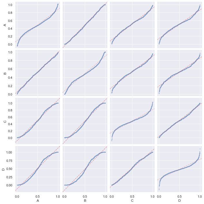
sns.pairplot(df_data, diag_kind="pp", kind="pp",
             plot_kws={'line_kws':{'color':'red', 'alpha':0.2}, 'scatter_kws': {'alpha': 0.2, 's':4}},
             diag_kws={'line_kws':{'color':'red', 'alpha':0.2}, 'scatter_kws': {'alpha': 0.2, 's':4}})
plt.show()
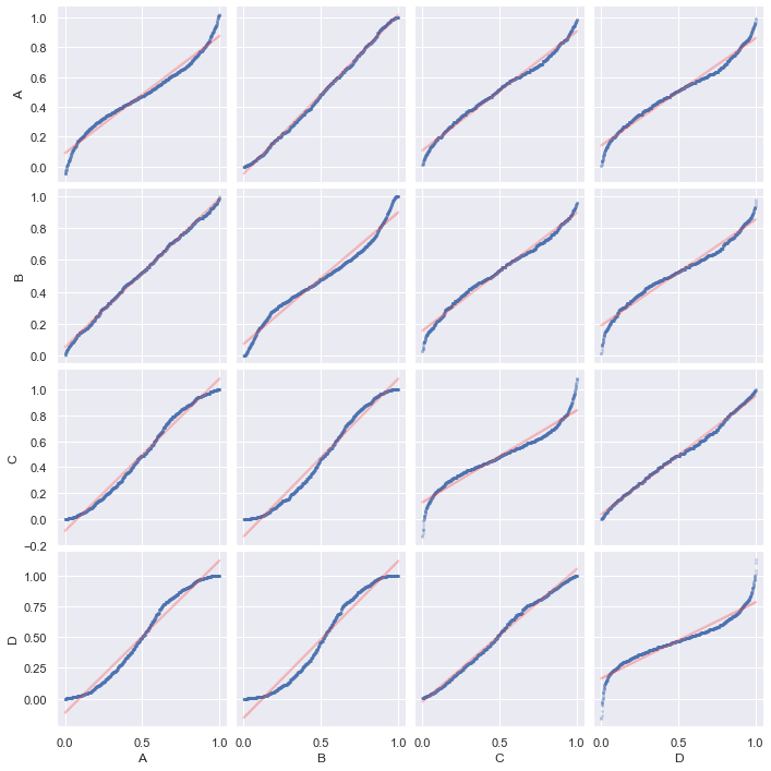
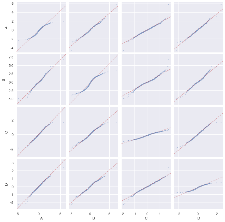
sns.pairplot(df_data, diag_kind="qq", kind="qq",
             plot_kws={'line_kws':{'color':'red', 'alpha':0.2}, 'scatter_kws': {'alpha': 0.2, 's':4}},
             diag_kws={'line_kws':{'color':'red', 'alpha':0.2}, 'scatter_kws': {'alpha': 0.2, 's':4}})
plt.show()
Of course, if you just want one PP-plot, you can use sns.ppplot() directly.
Better solution by PairGrid
The pairplot() function in seaborn is built with the
PairGrid object.
We can use it directly to make the pair plots but it would not be a single
function to achieve that. However, there would be more flexibility. This is an
example from the seaborn documentation that allows you to show different chart
above and below the diagonal:
# Fancier correlogram
g = sns.PairGrid(df)
g.map_upper(sns.scatterplot)
g.map_lower(sns.kdeplot)
g.map_diag(sns.kdeplot)
plt.show()
There can be PairGrid.map() for all charts in the grid, map_diag() and
map_offdiag() for on- and off-diagonal charts, or map_upper() and
map_lower() for the upper- and lower-triangular charts of the grid. We can
also provide a custom function to the family of PairGrid.map(). The exception
of map_diag() is to expect the custom function to take the \(x\) and \(y\)
data as positional arguments, while map_diag() takes only \(x\) data. With
this, we can define a few functions to be used:
import matplotlib.pyplot as plt
import seaborn as sns
import numpy as np
from scipy.stats import norm

def qqplot(x, y=None, **kwargs):
    """Create Q-Q plot, for use with PairGrid.map()
    Args:
        x, y: Passed as positional arguments, will be pandas series
        kwargs: Can be "color" (tuple of 3 floats) and "label" (str), or other
                keyword arguments passed by user
    """
    # Find scatter locations
    _, xs = stats.probplot(x, fit=False)
    if y is None:
        # set it to normal distribution scaled according to x
        ys = norm.ppf(np.linspace(0,1,len(xs)+2)[1:-1])
        ys = ys * xs.std() + xs.mean()
    else:
        _, ys = stats.probplot(y, fit=False)
    # Find regression line
    p = np.polyfit(xs, ys, 1)
    xr = np.linspace(np.min(xs), np.max(xs), 2)
    yr = np.polyval(p, xr)
    # Plot options
    line_kws = kwargs.pop('line_kws', dict(c="r", ls="--", alpha=0.5))
    scatter_kws = kwargs.pop('scatter_kws', {})
    scatter_kws.update(kwargs) # all remaining keyword arg assumed for scatter
    # Plot
    plt.axline(xy1=(xr[0],yr[0]), xy2=(xr[1],yr[1]), **line_kws)
    sns.scatterplot(x=xs, y=ys, **scatter_kws)

def ppplot(x, y=None, **kwargs):
    """Create P-P plot, for use with PairGrid.map()
    Args:
        x, y: Passed as positional arguments, will be pandas series
        kwargs: Can be "color" (tuple of 3 floats) and "label" (str), or other
                keyword arguments passed by user
    """
    # Find scatter locations
    xs = np.linspace(0, 1, len(x))
    if y is None:
        # set it to normal distribution scaled according to x
        y = norm.ppf(np.linspace(0,1,len(xs)+2)[1:-1])
    ys = np.interp(np.sort(x), np.sort(y), xs)
    # Find regression line
    p = np.polyfit(xs, ys, 1)
    xr = np.linspace(np.min(xs), np.max(xs), 2)
    yr = np.polyval(p, xr)
    # Plot options
    line_kws = kwargs.pop('line_kws', dict(c="r", ls="--", alpha=0.5))
    scatter_kws = kwargs.pop('scatter_kws', {})
    scatter_kws.update(kwargs) # all remaining keyword arg assumed for scatter
    # Plot
    plt.axline(xy1=(xr[0],yr[0]), xy2=(xr[1],yr[1]), **line_kws)
    sns.scatterplot(x=xs, y=ys, **scatter_kws)

def tukeyplot(x, y, **kwargs):
    """Create Tukey mean-difference plot, for use with PairGrid.map()
    Args:
        x, y: Passed as positional arguments, will be pandas series
        kwargs: Can be "color" (tuple of 3 floats) and "label" (str), or other
                keyword arguments passed by user
    """
    # Find locations
    xs = (x+y)/2
    ys = x-y
    mean = np.mean(ys)
    sd = np.std(ys)
    # Plot options
    line_kws = kwargs.pop('line_kws', dict(ls="--", alpha=0.5))
    scatter_kws = kwargs.pop('scatter_kws', {})
    scatter_kws.update(kwargs) # all remaining keyword arg assumed for scatter
    # Plot the mean and 95% ci lines
    xl = np.linspace(np.min(xs), np.max(xs), 4)
    plt.axhline(y=mean, c="b", **line_kws)
    plt.axhline(y=mean+1.96*sd, color="r", **line_kws)
    plt.axhline(y=mean-1.96*sd, color="r", **line_kws)
    sns.scatterplot(x=xs, y=ys, **scatter_kws)
and we can produce a PP-plot with them:
g = sns.PairGrid(df)
g.map_diag(ppplot, line_kws=dict(c="r", alpha=0.3, ls="--"), scatter_kws=dict(alpha=0.5, s=5))
g.map_offdiag(ppplot, scatter_kws=dict(alpha=0.5, s=5))
g.tight_layout()
plt.show()
and a QQ-plot:
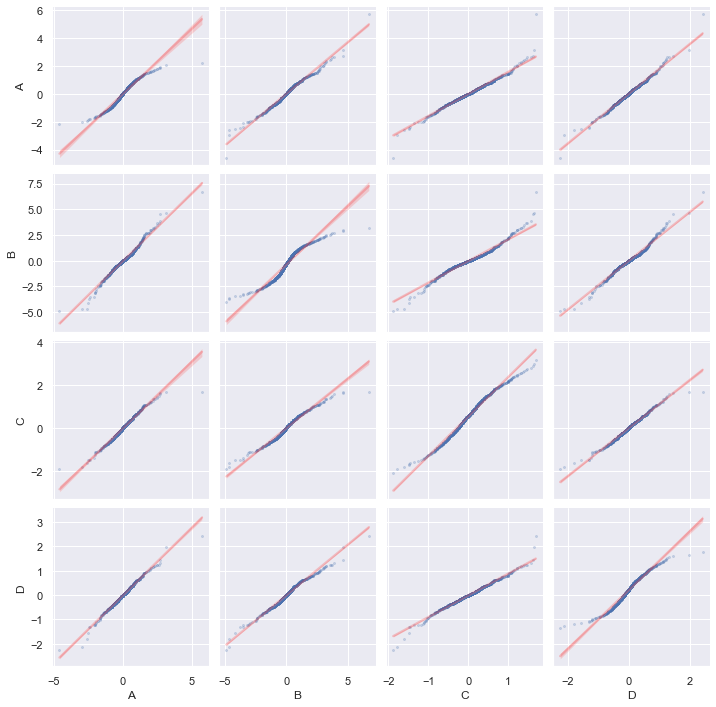
g = sns.PairGrid(df)
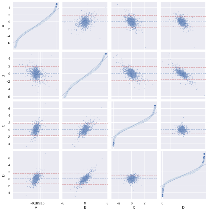
g.map_diag(qqplot, scatter_kws=dict(alpha=0.5, s=5))
g.map_offdiag(qqplot, scatter_kws=dict(alpha=0.5, s=5))
g.tight_layout()
plt.show()
and also Tukey mean-difference plot with PP-plot on diagonal, but we need to detach the shared axis for the diagonal plots due to different scale:
from itertools import product

g = sns.PairGrid(df)
g.map_offdiag(tukeyplot, scatter_kws=dict(alpha=0.5, s=5))
# Remove shared axis only for diagonal
for i,j,k in product(range(len(df.columns)), repeat=3):
    g.axes[i, i].get_shared_x_axes().remove(g.axes[j, k])
    g.axes[i, i].get_shared_y_axes().remove(g.axes[j, k])
g.map_diag(ppplot, line_kws=dict(alpha=0.3))
g.tight_layout()
plt.show()